WCAG 2.2 Color Contrast: Designing Accessible Web Themes under 2026 Directives
Global web accessibility guidelines have tightened. Learn the math behind color luminance and contrast ratios, and how to build AAA-compliant dark and light layouts using contrast tools.

WCAG 2.2 Color Contrast: Designing Accessible Web Themes
Web accessibility has shifted from a compliance checklist to a core design requirement. With global laws enforcing strict digital accessibility guidelines, developers must understand how color choices impact users with visual impairments. The cornerstone of readable user interfaces is the color contrast ratio.
The math behind contrast ratios
The contrast ratio measures the difference in relative luminance between the text (foreground) and its background. Relative luminance (L) is defined as the relative brightness of any point in a color space, normalized where 0 is absolute black and 1 is absolute white.
To compute relative luminance, the red, green, and blue sRGB channels are linearized and combined using coefficients that match human eyes:
L = 0.2126 * R + 0.7152 * G + 0.0722 * B
Once the relative luminance values for the lighter color (L1) and darker color (L2) are determined, the contrast ratio is calculated using the standard formula:
Ratio = (L1 + 0.05) / (L2 + 0.05)
This formula adds a 0.05 offset to account for ambient light striking the screen, resulting in a scale that ranges from 1:1 (lowest contrast, text invisible) to 21:1 (highest contrast, black on white).
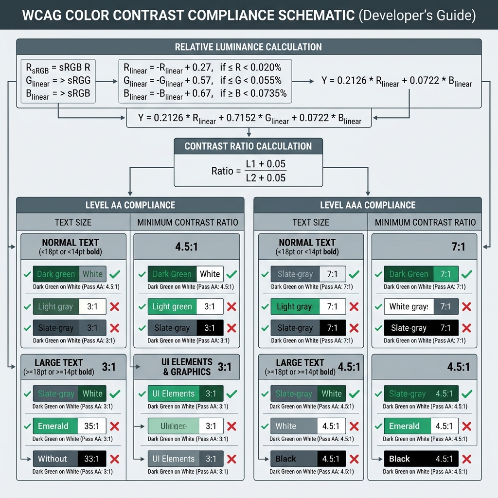
AA vs. AAA compliance thresholds
The Web Content Accessibility Guidelines (WCAG) group contrast requirements into two levels of rigor:
- Level AA (Minimum Contrast): Requires a contrast ratio of at least 4.5:1 for normal text (under 18pt or 14pt bold) and at least 3:1 for large text (18pt and above, or 14pt and above bold).
- Level AAA (Enhanced Contrast): Tightens the rules, requiring at least 7:1 for normal text and at least 4.5:1 for large text.
The future: APCA contrast
While the standard WCAG 2.1/2.2 mathematical contrast formula is widely adopted, it has known edge cases—such as overestimating contrast for light text on dark backgrounds. The upcoming Advanced Perceptual Contrast Algorithm (APCA) addresses this by incorporating spatial frequency (font weight/size) and context-dependent light adaptation to reflect actual human perception.
Conclusion
Designing accessible themes is not about sacrificing aesthetics; it is about intentional color matching. By ensuring your brand palettes maintain a minimum 4.5:1 ratio, you provide a readable interface for everyone while building long-term SEO and user retention.
Try it free